

Gather
The Neighborhood Food Sharing App
Introduction
Background
HCDE 518 User Centered Design, Autumn 2019
School: University of Washington, Seattle
Program: M.S. Human Centered Design & Engineering
My Role
UX Designer, Project Manager, and Researcher
Constraints
Time
Resources
Group Dynamics
First Academic UX Project
The Problem Space
There is an increasing need for sustainability due to the environmental impact of humans and limited resources. One way to reduce our impact is to reduce waste. According to the USDA, food waste is estimated at between 30-40% of the food supply. Additionally, food is the largest single source of waste in municipal landfills. There is a dire need for innovative solutions to tackle the food waste problem, which led our team to explore the area of food sustainability.
Design Question
“How can we help households reduce food waste?”
Process
Research
Engagement
Methodologies
Activity Analysis
Survey
Interviews
Fly-on-the-Wall
Competitive Analysis
2 surveys
84 responses
6 interviews
4 observed environments
Key Takeaways
After formulating the design question, the in-depth research phase began. Five methodologies were pursued: Activity Analysis, Surveys, Interviews, Fly-on-the-Wall and Competitive Analysis.
The majority of people we surveyed did not have access to compost. The top reasons people gave for food waste in their homes were expired foods, lack of planning, and over-purchasing. When probed around the importance of waste reduction, people spoke in terms of “we” and wanted to feel part of a larger community effort. We concluded our solution should help our users address the top causes of food waste in their homes and bring together individual efforts.
The ability to unite individual efforts and make people feel that they made an impact turned into an important user need.
Personas
Based on user research the following personas were created:
Maria
A busy mom with kids, who regularly cooks, often buys in bulk, and has too many leftovers. She feels guilty about wasting food.
Alex
A young professional who uses food apps and has a tendency to let her groceries expire. She wants to save money on groceries and have access to a more convenient food disposal method.
Joe
A professional who is passionate about food. He loves hosting and entertaining people, so he often has leftovers that go to waste, which is one of his frustrations. He is skeptical of his individual impact on the environment and envisions greater community involvement.
Ideation
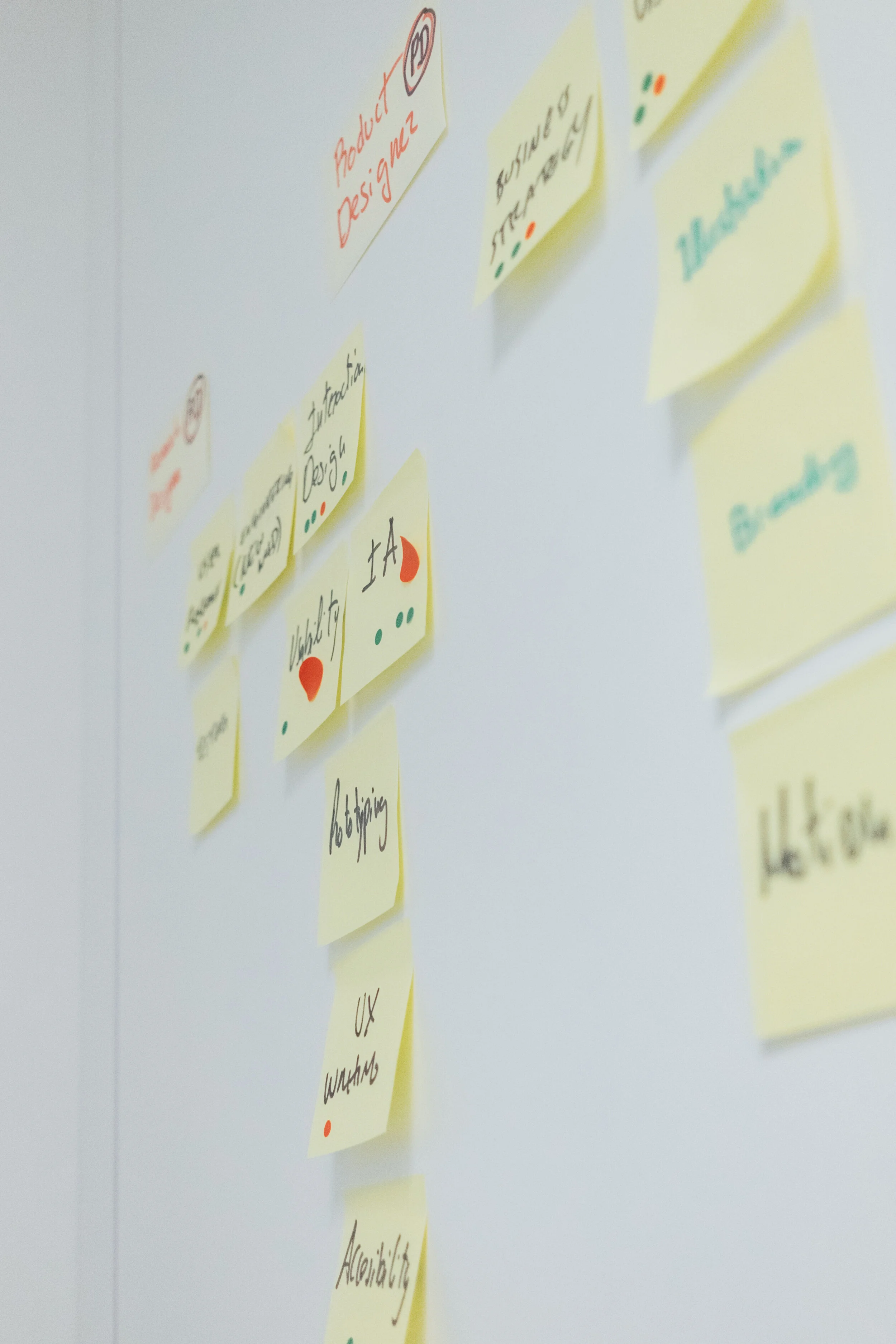
After creating our personas and design requirements, our team gathered for a brainstorming/ideation session. The goal was to sketch a multitude of ideas that could address our users’ needs. We employed the 8x8 method to produce two rounds of sketches. A total of 48 sketches were produced and organized by similar category (affinity diagramming). From there, each category was critiqued based on pros, cons, feasibility, and originality.
Top 3 Concepts:
Community Food Share
This tool allows users living in the same area i.e. neighborhood or apartment complex to connect around food sharing. In addition to giving and receiving food items, a unique aspect includes hosting a potluck with items already purchased by community members.
Grocery Itemization
This tool itemizes items purchased at the grocery store and stocked in the home. It can easily be linked to your rewards card and has the option of notifying users of soon-to-expire foods.
Family Meal Planner
This tool allows household members to collaborate in meal planning and grocery shopping. This could be paired with the grocery itemization tool.
Winning Concept
We moved forward with prototyping the community food sharing concept because it addressed a wide range of our users’ needs and tackled an area in need of solutions and innovation, as indicated from competitive analysis.
Prototyping
Figma was used to wireframe, iterate, and prototype the chosen design concept from our ideation and sketching session. A mid-fidelity prototype was made to understand user interactions and overall process flow. The features emphasized were those key to helping our users reduce food waste in their homes.
Creating an account
Home Screen
Giving an Item
Asking for an item
Finding a donation location
This mid-fidelity clickable prototype allowed us to decide what features to add or remove before testing, and helped us to explore undiscovered features and elements of design. Another learning was recognizing the appropriate level of fidelity necessary at this stage of the process. With a working prototype, user testing and evaluation could begin.
Usability Study
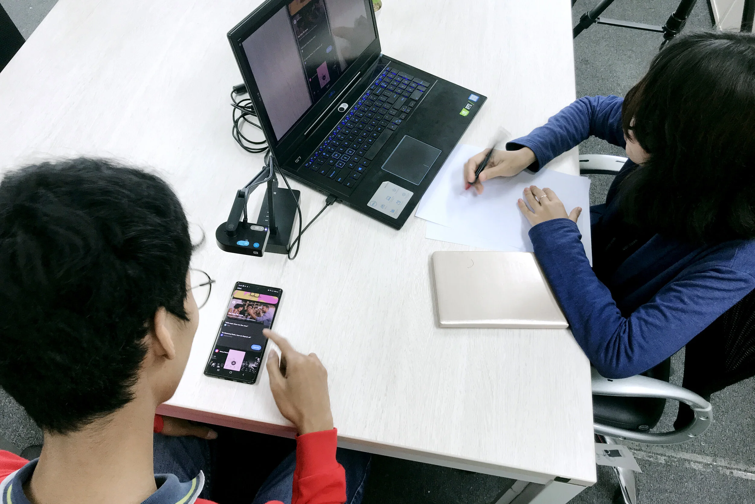
A mid-fidelity prototype was created to quickly test our design concept, information architecture, and application flow. The overall goals of the study were to evaluate user interactions and collect feedback on the design. Additionally, we wanted to determine which aspects of our design were well-liked. Participants were encouraged to think aloud as they worked through tasks.
Methodologies
In-Person Moderated Testing
4 Users
Key Findings
Registration & account setup took too long
Map view during account set up was confusing
Tutorial necessary for newer concept
Several screens cluttered and too similar
Final Product
Refinement
Taking key learnings from our usability study, we decided to implement the following changes:
Add Tutorial/On-boarding
Create a task screen
Refine and simplify community activity feed
Tutorial/On-boarding
A tour that walks new users through key activities of the application such as joining a community, hosting an event, and giving food.
Rationale:
The tutorial was created to highlight key features of the app and introduce users to the concept of a community food sharing app. Competitive analysis and usability testing showed that food-sharing was a newer concept within the mobile application market.
Task Screen
A new screen that users encounter when selecting the add button. This screen contains the primary actions of the app, allowing users to give an item, ask for an item or host an event.
Rationale
The three main features were highlighted on a single screen to provide users with an accessible layout to select a task. During the usability study, users preferred selecting options step-by-step rather than in one screen. Additionally, testers reacted positively to having these options for combating food waste. This was aligned with user research indicating their top causes of food waste.
Activity Feed
Allows you to see all Give, Host, and Ask posts from neighbors
Rationale
This feature was meant to help users envision their community as an active gathering and giving hub bustling with activity while encouraging user engagement. The icons help users visualize main categories of Giving, Asking, and Hosted events.
Prototype Demo
Demo takes users through core features of the app
Giving
Asking
Hosting
Final Thoughts
Reflection
Our team learned valuable lessons along the way of this quarter-long project.
Personas were a helpful tool in capturing key insights from research and keeping users at the forefront throughout the design process.
The fidelity of prototypes are important to consider for usability studies. In retrospect, we could have saved time by keeping a lower mid-fidelity prototype and building more features and functions to test.
Future Work
Given extra time, our team would implement the following aspects and potential new features:
User reviews & badges within profiles to enhance safety and increase engagement.
Interaction of accessing Events via the navigation bar and building out its functionality.
Highlighting “Give” food items that will expire soon.
Additional safety features such as scanning a government-issued ID for user verification.